Creative K.I.S.S.

Sage Journal • February 5, 2019
Have you ever wondered why so many signs, banners, vehicle graphics and other displays have simple blocky fonts and more standard red and black on white background or vice versa? Well there’s a very simple reason, readability! The creative scripts with thin lines and swooping letters in a pale yellow on a white background, just are not going to do it. Big and bold is! While it’s not that simple and you do want to stand out in the crowd, some things to consider are those things and a few more.
Being Creative and keeping it simple stupid don’t seem to go together very well, and may even be insulting, but sometimes there’s such a drive to have the next creative look and feel, that the message get’s lost and the ROI becomes frustrating.

“So I say be creative, but keep a few things in mind when doing so.
1: CONTRAST IS IMPORTANT
Yellow on orange reminds me of a local restaurant chain that has opened up more and more locations, but every time I look at their signage it hurts my eyes. Black, red, other darker vibrant colors and or variations of these colors on a light background or vice versa is what I would encourage, at the very least be aware of contrast.
2: THE FONT
It’s incredible, we are not even sure how many fonts are out there (with new ones being created all the time). You can go to various sites like fonts.com and they have over 133,000 fonts, while we know there are well over 200,000 fonts out there, when you consider all the families of fonts, both commercial and free fonts, we are not fully sure how many font’s there truly are. One thing is whether you are the designer or the client, owning the font for future changes, edits, is recommended.
3: WHITE SPACE
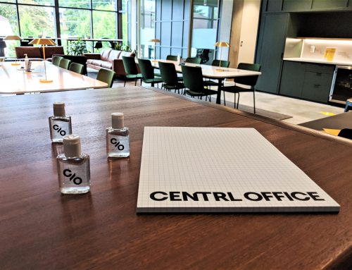
White space is something you don’t have to be afraid of; it helps with readability. Too often due to cost or lots of things to share, signage is laid out with too much text and imagery. What this does is crowd everything, making it to busy, and hard to read. As a lot of great Art Directors and Designers I have known over the years say, “don’t be afraid of white space. “
4: SIZE DOES MATTER
Here you will find an example of what size your text should be for best readability from various distances. If you use this as a guide you will be good to go.
DON’T BE AFRAID OF WHITE SPACE!
| LETTER HEIGHT | DISTANCE FOR MAXIMUM IMPACT | READABLE DISTANCE |
|---|---|---|
| 3 inches | 30 feet | 100 feet |
| 4 inches | 40 feet | 150 feet |
| 6 inches | 60 feet | 200 feet |
| 8 inches | 80 feet | 350 feet |
| 9 inches | 90 feet | 400 feet |
| 10 inches | 100 feet | 450 feet |
| 12 inches | 120 feet | 525 feet |
| 15 inches | 150 feet | 630 feet |
| 18 inches | 180 feet | 750 feet |
| 24 inches | 240 feet | 1,000 feet |
| 30 inches | 300 feet | 1,250 feet |
| 36 inches | 360 feet | 1,500 feet |
| 42 inches | 420 feet | 1,750 feet |
| 48 inches | 480 feet | 2,000 feet |
| 54 inches | 540 feet | 2,250 feet |
| 60 inches | 600 feet | 2,500 feet |
This is prepared by the California Institute of Technology. The distances vary with different color combinations. There are other factors when it comes to designing your signage/graphics, but this will give you some food for thought!
DALLAS ROEMELING
Owner

